


This segment will delve into some strategies and concepts for building a user-friendly landing page. Just as a businessman needs the right attire and a woman the perfect gown, a landing page demands a carefully designed layout with strategically positioned content.
Our previous piece "Crafting your Landing Page: Part I" elucidates the comprehensive process in detail for those unfamiliar with how to develop a landing page from scratch.
Keep in mind that the creation of a website demands more time commitment than simply going through this write-up. However, don't let that discourage you. By venturing into designing the website on your own, it's possible to conserve up to five thousand dollars. So, are we ready to start?
Trick 1 - Four dimensions of power
Have you ever noticed the grid layout when taking a picture? This concept is known as the "rule of thirds", and it's also relevant to web design. This principle segments the webpage into three sections, consequently forming nine identical squares.
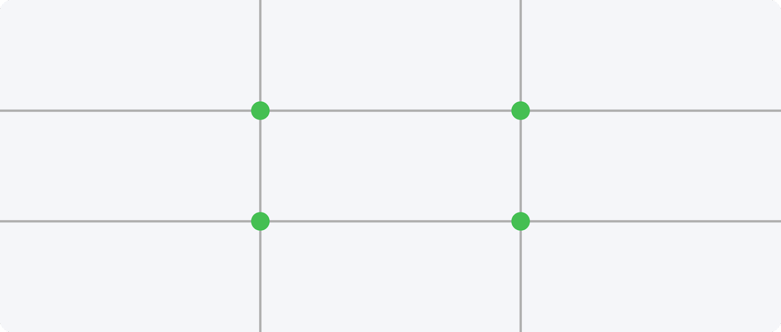
The central intersections of four overlapping lines define the "power dimensions". The human eye instinctively gravitates towards anything situated within these constraints first. Therefore, when formulating a landing page, position the most crucial elements at these crossroads.
Trick 2 - Hick’s law
British psychologist William Edmund Hick put forth an idea asserting that with an increase in available choices comes an extended duration required for decision-making. This means that as our selection options expand, so too does the time it takes for us to make a choice.
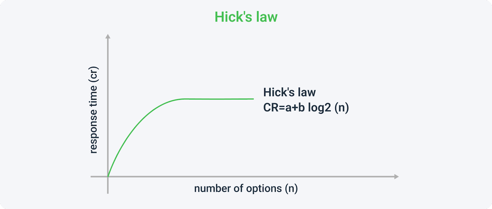
In their research, Mark Lepper and Sheen Iyengar found an intriguing phenomenon: consumers were less attracted to a table showcasing 24 distinct jam flavors than they were to one with just 6. Further, they noticed that an overload of choices led to a drastic reduction in the likelihood of making a purchase. What implications does this have for our landing page design? It suggests we should limit the number of CTAs and buttons, focusing instead on achieving a single goal. We must contemplate the possible decisions users may encounter and strive to minimize these as much as feasible.
Trick 3 - The “F” Model
Several studies have established that a person's gaze follows a particular trajectory when reading text. It starts from the left, moves across to the right, and then descends downward. Typically, the lower right corner receives minimal attention as it is often only briefly glanced at.

In order to enhance user understanding and promote engagement, prioritize elements in an F-shaped layout. This format should position critical information near to where the F would be situated. Additionally, prominently display contact methods such as social media handles or phone numbers for easy visibility.
Trick 4 - The 8-Second Rule
The Eight-Second Guideline: The mental focus can maintain on a specific task is confined to eight seconds, and recent research suggests this duration could be diminishing even further. How then do you engage a user's attention within such a fleeting time frame? Create an engaging and thrilling headline that efficiently conveys the advantages of the product or page, while simultaneously acknowledging any challenges encountered by the consumer. Enhance your message's prominence by integrating graphics that underscore the function of your offering. Design a brief yet conspicuous call-to-action button.
Trick 5 - The Law of Similarity
Principle of Resemblance: The perception people have towards a whole entity often deviates from the way they view its separate elements. We are inclined towards having things around us that are similar, yet uniquely classified.
Leverage the favorable feedback your product has accumulated and strategically place either your app or a form in close proximity where the review can be noticed.
Trick 6 - Social proof
Leveraging Social Validation: A study conducted by Data Insight and AliExpress revealed that a whopping 90% of purchases come to fruition only after customers scrutinize reviews. When designing your website, it's highly beneficial to incorporate customer testimonials. This notion of social validation could be demonstrated through accolades or certifications.
Are you acquainted with the phrase "above the fold"? If this term sounds unfamiliar, allow me to elucidate. It signifies that section of a website which is visible without necessitating scrolling down the webpage.
With every passing year, we see a decline in people investing time in reading; most prefer to quickly glance over articles. According to research by Nielsen Norman Group, content at the top of a webpage garners more attention from users than information towards its bottom – this approach has been found to increase effectiveness by up to 84%.

An explanation for why extensive content might deter users lies in its demand for greater user engagement, such as needing frequent scrolling down the page. Essentially implying that an abundance of text inversely affects user inclination towards reading.
LANDING PAGE - DESIGN AND UX
In choosing the layout for your site, it's crucial to understand your potential users. Do they identify as male or female? What line of work are they in? How do they spend their free time? What drives them and what are their anticipations? Your answers to these questions can significantly guide your decision-making. Are you inclined towards a soothing pastel color scheme, or would a darker, more mysterious one suit better? Once you've established the basic framework and have a clear preliminary concept for your website, it's imperative that you follow certain guidelines.
Rule #1 - High-quality images
Research conducted by Bright Local illustrated that 60% of individuals prefer search findings that incorporate images. Complementing this, a study by Skyword revealed that striking photos attracted an average of 94% more viewership. To maximize the impact of your imagery, it is advisable to eschew mundane and uninspiring selections in favour of imaginative and fascinating alternatives. Although acquiring such images might necessitate expenditure, numerous platforms offer a vast selection of superior-grade visuals at no charge whatsoever. Examples encompass:
Image size
The entire user experience is influenced by website speed, and thus the size of images and videos should be kept to a minimum. For those with Windows, compressing images can be accomplished using the following tool:
MacOS users, we suggest using the following for compressing pictures:
Online image compression softwares:
Video size
Regarding the size of the video recordings, the situation is comparable to that of images. But it is a bit more intricate. Photos can be merely several MB, while videos generally take up more than one hundred MB, which can impede the speed of your website significantly.
The best video compressors:
MediaCoder (Windows only),
AVS Video converter (Windows only),
Rule #2 - Colors
The selection of hues for promotional material is crucial, as it can modify how your enterprise is perceived by potential customers. To gain a deeper understanding of the impact color can have in affiliate marketing, we recommend you peruse our article "The psychology of color in affiliate marketing. How will the details change your earnings?
It's critical to verify that the colors representing your brand are not only appropriate to its objective but also visually pleasing to your target market. However, what ultimately matters most are the services provided and their quality.
In designing an inclusive space for individuals with disabilities, careful consideration must be given to color application. According to rule number four, one should refrain from positioning two bright colors adjacent to each other - specifically blue and green - as this could pose a challenge for those with color vision deficiency. The optimal choice would be black text on a white backdrop.
Rule #3 - Bright and clear headlines
Users remembering your page and developing a desire to return is essential. Use of an engaging but subtle headline significantly aids in achieving this. Further, it's vital to keep persons with impairments or those who are digitally marginalized in mind, by making navigation through your site easier for them. This is the desired presentation.
Rule #4 - Accessibility for people with disabilities
We've compiled a range of factors to keep in mind while developing a website that caters to the needs of individuals with disabilities. Utilizing this modified content will concurrently enhance your SEO, subsequently boosting your site's visibility on search engines such as Google.
ALT descriptions
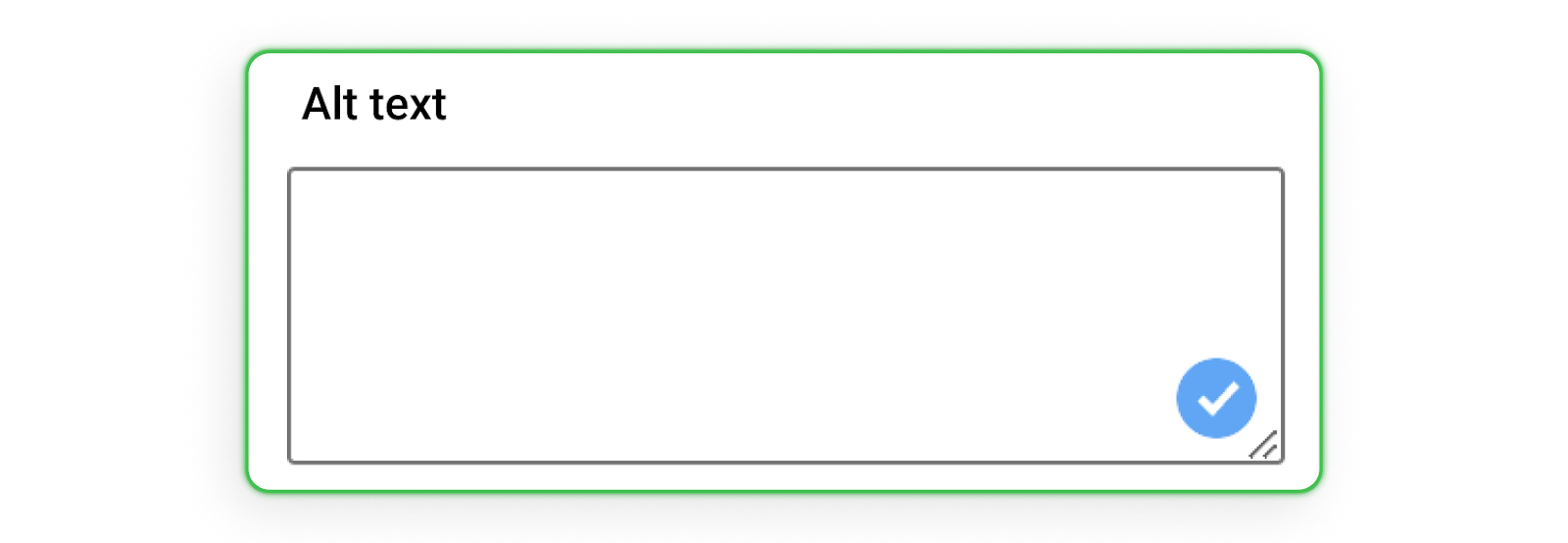
ALT tags serve as a substitute explanation for visuals featured on websites. They are particularly valuable to people with vision issues, as their software can decode the images. Furthermore, those struggling with slow internet connections benefit from ALT tags since they reveal the image's content without requiring it to be fully loaded.
Video Subtitles
If your website hosts a plethora of videos, embedding subtitles is a practical measure for aiding hearing-impaired individuals. For extended audio files, transcription proves beneficial. Online platforms like veed.io can facilitate automated subtitle integration.
Appropriately Edited and Distinguishable Links
A more advantageous approach than simply embedding "Click here" in your script would be to phrase it as "For further details, feel free to visit [website address]". This technique proves extraordinarily helpful for visually impaired users. Additionally, distinguishing hyperlinks by using a color deviating from that of regular text simplifies user interaction; they won't need to scour the page with their cursor hunting for links.
Button dimensions
If the clickable components leading users to different sections of your site are not adequately sized, it might pose a challenge for people who struggle with site navigation. It's crucial to make certain that the click-able region of these buttons is appropriately expansive.
Navigating via keyboard
The layout of your website should be structured in such a way that hitting the "TAB" key logically guides users through menu options and other functionalities. This approach simplifies website navigation for individuals with disabilities, making their experience more manageable.
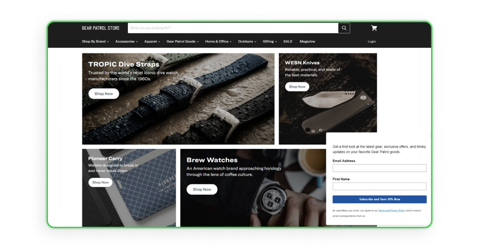
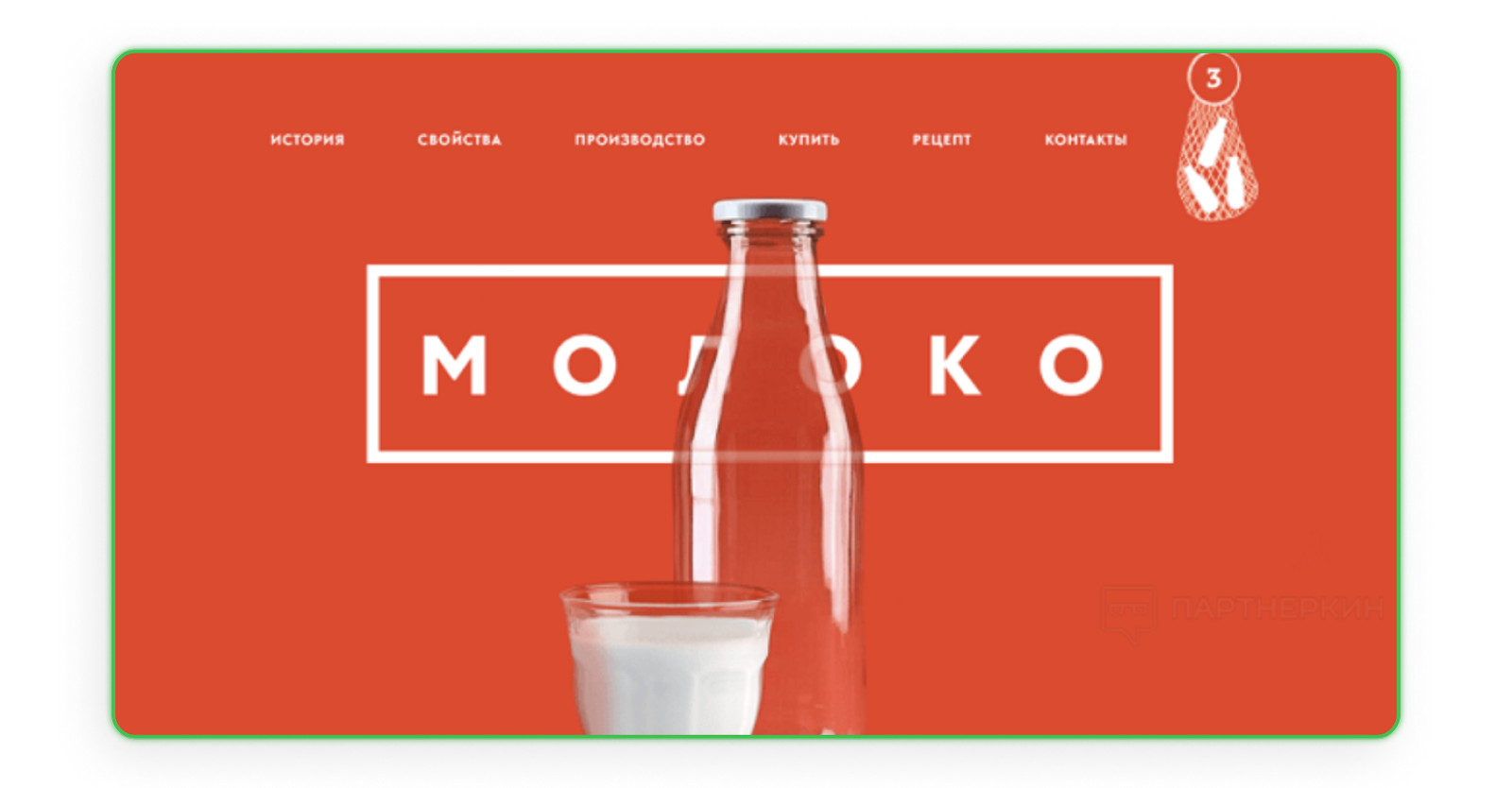
Rule #5 - Space
Ensuring immediate comprehension of your site's purpose is crucial as soon as the visitor lands on it. A cluttered interface filled with excessive text and advertisements can confuse users about their next steps. Such pages have become a rarity these days. However, enhancing the layout of such a page is plausible, as demonstrated in the following example.
The introductory details about the business are straightforward enough to comprehend; however, keep an eye on what follows. The myriad links and suspiciously spam-like phrases can easily cause information overload; it's advisable to avoid this scenario at all costs.
Rule #6 - Transparent menu and symmetry
The primary navigation tool must be uncomplicated, with the menu exhibiting similar simplicity. Current trends favor a simple, user-friendly menu located at the top. Moreover, it's crucial that the homepage exudes visual equilibrium; this is generally perceived as aesthetically appealing by most users.
Rule #7 - Footer
In summary, the creation of a website's footer demands consideration and careful planning. Its straightforwardness and attractiveness are fundamental elements. It is crucial to identify what actions you expect from users who navigate to the bottom of your webpage. Understanding this will simplify the process of designing an effective footer. Typically, individuals scroll down a webpage in search of contact information.
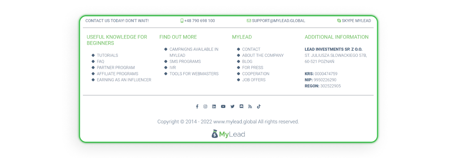
This doesn't imply that items significant to you cannot feature in the footer section. The crucial aspect is maintaining user satisfaction with the site while also fulfilling your goals. Several things can be incorporated into the footer, providing examples such as:
privacy policy and terms of use,
contact details,
navigation,
links to social media,
subscription to the newsletter.
LANDING PAGE - TEXT CONTENT
Following the generation of headers and clickable buttons, next comes the creation of the website's content. This information should correlate with the advertised promotion and effectively convince potential buyers to purchase.
Building an effective user interface necessitates having a systematic structure in place. A guide or layout can be drafted on paper or using PowerPoint to aid in organizing this structure. It is vital to answer key questions such as what, where, when and why for clear comprehension by users. Information presentation must be logical: it should explain what exactly is on offer and why it's necessary for users. To enhance credibility, including credentials could prove beneficial. For LeadGeneration sites especially, keeping content simple yet informative with minimal steps will help boost conversion rates
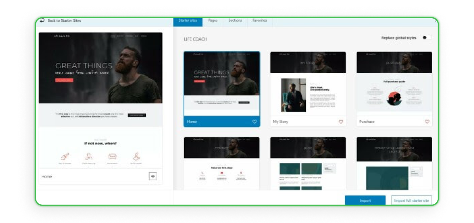
In today's digital landscape, there are tools available that simplify the website building process while delivering attractive results across all devices; Kubio being one case in point - a tool that seamlessly integrates with Gutenberg providing maximum design flexibility along with an enjoyable page-building experience for its users. With this plugin at their disposal, even individuals who lack knowledge about WordPress templates can effortlessly edit entire web pages through a unique and easy-to-use interface.
Main features of Kubio Builder:
create entire pages in a single, intuitive interface,
advanced design and responsive options,
create pages by combining pre-defined sections,
vast template gallery,
extensive block library.
YOU’RE ALREADY HERE?
Since you've arrived here, it's likely that you possess the necessary expertise to construct a website that exudes professionalism. The only thing left to do is extend wishes for your triumph!


.gif)

.png)
.png)


